Overfitting: Why a Perfect Backtest Curve Is a Warning Sign
There is a paradox at the heart of backtesting that almost every retail investor learns the wrong way. You are told: test your strategy on history. You do. Some versions come back with a modest curve, and one version comes back with a beautiful one — steep, smooth, with barely a drawdown. The natural conclusion is: pick the beautiful one. The honest conclusion is: distrust it. The nicer the backtest looks, the more likely it’s not telling you the truth.
This post walks through what overfitting actually is, why a perfect equity curve should worry you rather than reassure you, the three ways overfitting sneaks into a strategy without you noticing, and the practical checks a retail investor can run to distinguish a robust strategy from a curve-fit one.
What overfitting actually is
A strategy is overfit when it looks amazing on past data because it has learned the specific noise of that data, not the underlying pattern the data contains. It performs beautifully in the window it was built on, and often falls apart the moment you point it at any other window.
The analogy that works is exam preparation. If you memorise the answers to last year’s exam, you will score 100% on last year’s exam. Whether you understand the material — and whether you’ll pass this year’s exam — is a completely separate question. An overfit backtest is a strategy that has “memorised” the past instead of learning something about how markets behave. On the past, it’s flawless. On the future — or on any other slice of history — it doesn’t hold up.
Markets are full of what statisticians call noise: short-term movements that don’t repeat, coincidences that look meaningful in one year and vanish the next. A strategy simple enough to only respond to signal — persistent, structural patterns like “when volatility spikes hard, defensive assets typically hold up better” — has a chance of working going forward. A strategy that has enough moving parts to also respond to the noise of one specific decade will look better in that decade, and worse everywhere else.
Why perfect curves should worry you
Once you internalise the difference between signal and noise, the intuition flips: an equity curve with almost no drawdowns and a near-linear upward slope is not a triumph — it is a warning that the strategy has fit the noise as well as the signal.
Real markets have real drawdowns. Even excellent strategies get caught by regimes they weren’t built for; even great signals produce false positives from time to time. A backtest that shows no drawdowns is not showing you a great strategy; it is showing you a strategy that has enough degrees of freedom to dodge every historical dip, which is exactly what an overfit strategy does. On real markets going forward, those dodges won’t be available because the noise of the next decade will be different from the noise of the last one.
The rule of thumb worth carrying: look at the ugliness before you look at the beauty. A backtest with realistic drawdowns during periods that stress the strategy — crashes, choppy markets, whatever regime the design isn’t built for — and modest underperformance in the sideways stretches is more honest, and more likely to keep working, than one that shows a graceful curve straight through everything. If a strategy dodged the 2020 crash cleanly on paper, the interesting question is why. If the answer is a rule that would only have triggered in exactly the shape of 2020, you don’t have a strategy — you have a story about 2020.
There is a valuable flip to this. If you can see which regime a strategy struggles in, that is not a defect — it is information you can act on. A strategy with a known blind spot in, say, a sideways stress regime is a strategy you know how to complement: pair it with a second one that behaves well in exactly that regime, and the portfolio of the two carries you through more of the possible futures than either could alone. That’s the whole logic behind combining strategies into a portfolio. What you can’t diagnose, you can’t defend against.
Three ways overfitting sneaks in
Overfitting rarely happens because someone deliberately curve-fits. It happens quietly, through decisions that feel reasonable in the moment. Three specific patterns cover most real-world cases.
Too many parameters. Each parameter you add to a strategy — a threshold, a lookback window, an ETF choice, a rebalance rule — gives the strategy more capacity to shape itself around the past. Three well-chosen parameters that each map to a clear market intuition are honest. A strategy with a dozen parameters, each tuned to a specific number, has almost certainly bought its backtest performance with fit-to-noise. The mental test: could you defend each parameter to a stranger without pointing to a backtest number? If not, you probably have one too many.
Selecting the best of many attempts. This is the subtlest form and the one that catches serious analysts by surprise. If you build one strategy and test it, the backtest number is meaningful. If you build a hundred variations and pick the one with the highest Sharpe, the winning number is meaningless — you have simply found the variation that happened to align best with the noise of the past. The distribution of results across all hundred attempts contains the honest information; the maximum does not. Retail investors do this constantly without realising it: try one setting, don’t like the result, try another, keep the one that looks best. The strategy you keep is not the best strategy — it is the best-fitted-to-past-noise strategy.
One preventive rule worth borrowing from personal practice: discretise your thresholds. Instead of tuning a Fear-Index cutoff to a precise number like 63.7, snap it to a round 5-point grid (60, 65, 70, 75…) or at finest 2.5%. That single constraint kills most of the “keep tweaking until it looks better” loop, because you literally can’t fine-tune your way into the noise — the grid is too coarse for that. The follow-on check is just as useful: once you’ve picked a threshold, move it by a step and see what happens. If the result changes drastically, the strategy is riding on that exact threshold value; it’s not the design that’s producing the number, it’s the fit. A robust strategy should work in a band around your chosen threshold, not on a single point of it.
No held-out data. The most preventable pattern is also the most common one. If you tweaked thresholds on 2015-2026 data and then look at the 2015-2026 backtest, you’re grading your own work — the number is a self-congratulation, not a test. The honest move is to build on part of the data (say, 2015-2022) and only then look at what happens on the rest (2023-2026, untouched). Skipping the split turns the backtest from evidence into decoration. And combining two strategies that were both fitted this way doesn’t fix anything: a blend of two overfit strategies is still an overfit portfolio, not a diversified one. See combining strategies into a portfolio for what genuine diversification actually requires.
How to spot it as a retail investor
You don’t need a PhD to detect overfitting. Six practical checks — ordered from quickest to most involved — catch most of it, and every one of them is something the PortfolioLab tool actually lets you do.
1. Count your parameters honestly. For each rule in your strategy, ask: does this parameter map to a market intuition I could explain to someone with no computer, or does it just happen to make the backtest number bigger? The first kind is a signal; the second kind is fit-to-noise. If more than half of your parameters can’t survive the plain-English test, you have too many.
2. Look at the shape of the drawdowns. A realistic equity curve has drawdowns during the regimes that stress the strategy (crashes for equity-heavy designs, choppy sideways markets for trend-based ones, depending on what your strategy is built for) that are meaningfully shallower than buy-and-hold, but not zero. A curve that shows near-zero drawdowns through 2020 has either a genuine tail hedge that fired at the right moment (fine, and testable elsewhere) or has fitted a rule that would only have triggered in exactly the 2020 shape (not fine, and not testable).
3. Move a threshold by a step. Take one of your Fear-Index thresholds and shift it by 5 points in either direction. Re-run the backtest. A robust strategy has similar numbers on either side of the shift — same shape of equity curve, comparable CAGR, comparable drawdown. If moving a threshold from 60 to 65 (or 60 to 55) changes the story dramatically, the strategy is riding on that exact value, and the exact value is almost certainly noise. Do this for the most-important thresholds in your setup.
4. Swap the offensive ETF. If your strategy’s offensive zone runs on a leveraged Nasdaq ETF, run the same strategy structure with the non-leveraged version, or with a broad-market ETF. If your defensive zone runs on Utilities, try Minimum-Volatility or Real Estate. A robust design survives sensible asset substitutions: the numbers change (they should), but the shape holds. If the strategy only works with one specific ETF, you have not built a rule set — you have built a bet on that ETF.
5. Split the window. Take your available data — say, 2015 to today — and build the strategy on the first 70% by restricting the Optimizer’s date range. Then extend the range to include the last 30% and re-run, without changing anything. Compare CAGR, Max Drawdown, and Sharpe between the two halves. A small gap (Sharpe drops from, say, 1.4 to 1.2) is normal and honest. A large gap (Sharpe 3 in-sample, 0.3 out-of-sample) is the signature of overfitting.
6. Cross-check with the European equivalent. If you built the strategy on US ETFs and the US Fear Index, rebuild the same shape — same zones, similar threshold bands — with European ETFs and the EU Fear Index. The two are not identical (the signals aren’t interchangeable and neither are the assets), but they’re related enough that a robust structural idea should show up as reasonable on both sides of the Atlantic. If your design falls apart when you rebuild it for Europe, you’ve probably overfit to one specific market’s decade.
The chart below makes check #5 — the split-window test — concrete.
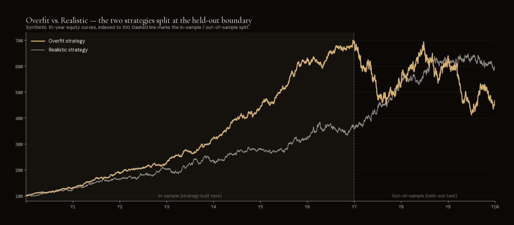
Synthetic illustration. Two strategies over the same 10-year window, indexed to 100. The dashed vertical line marks the in-sample / out-of-sample boundary. In the in-sample half, the Overfit strategy (yellow) looks unbeatable — a Sharpe of roughly 3, barely any drawdowns. The Realistic strategy (grey) climbs modestly, with a short flat stretch mid-way that any honest strategy will have. Out-of-sample, the Overfit strategy collapses to underperformance and volatility; the Realistic one keeps roughly the same shape and eventually overtakes. Pick by the in-sample line alone and you take the worse of the two live.
How PortfolioLab helps — and where the honest work is still yours
The Strategy Optimizer in PortfolioLab is a compare-and-tune tool: pick a strategy, edit a threshold or swap an ETF, and see the modified backtest side-by-side with the original. That saves you the tedium of rebuilding a strategy from scratch every time you want to test a small change — which is where most of the “test a hundred variations” trap lives when you do it by hand.
One thing worth naming while we’re on the subject of trustworthy backtests: the historical simulation in PortfolioLab is point-in-time honest — every decision the strategy takes on a given day is based only on data that would have been available on that day. There is no look-ahead bias, no accidental peeking at tomorrow’s Fear Index reading to inform today’s rotation. That’s not something the backtester lets you turn off; it’s how the pipeline is built. It matters because backtests that quietly use future data can produce astonishing-looking results that would never have been achievable live — and that’s a class of overfitting error the user of the tool cannot make by mistake.
But the discipline the Optimizer can’t enforce for you is exactly the one that matters most for overfitting: whether you’re testing your candidate strategy on data it hasn’t seen. The Optimizer will happily let you tweak thresholds on the full 2015–2026 window, watch the equity curve get smoother with each edit, and end up with a beautifully overfit strategy that looks great on the window it was fitted to. What the tool provides is speed; what you have to provide is method.
The honest workflow is straightforward:
- Restrict the date range on the Optimizer to a build window (say, 2015 through 2022) while you tweak
- Once you’re happy, extend the date range to include the held-out data (2023 onward) and run the backtest again — untouched
- Compare the two runs. A modest gap is expected; a cliff is your answer
That’s the closest a retail investor comes to a proper out-of-sample test, and it takes about two minutes with the Optimizer’s date-range control.
There is one honest limit to name, because it applies to every backtest and no tool can fix it: the last decade doesn’t contain many real crises. One sharp crash (2020), one rate-hike correction (2022), and long stretches of a bull market — that’s the sample you have to test against. A strategy that survives split-window checks and asset substitutions on that history has done well, but it has not proven itself against a 2008-shape event, or a stagflation regime, or a decade of sideways markets. The split-window test is a necessary check; it is not a sufficient one. What has to complement it is mental reasoning — a coherent, structural argument for why the strategy should work in the future, not a statistical demonstration that it worked in the past. A backtest is evidence; the case for the strategy has to be made by you, on top of the evidence.
The honest read of a trustworthy backtest
Pulling the six checks together, the pattern of a strategy worth trusting more than the “perfect” one looks like this:
- A backtest with realistic drawdowns during the regimes that stress it — meaningfully shallower than buy-and-hold, but not zero
- Three to five parameters you can each defend to a stranger without pointing to a number, snapped to a coarse grid (5-point Fear-Index thresholds, not decimals)
- Similar behaviour when a threshold moves by one step — the strategy works in a band, not on a single point
- The same shape with a sensible asset substitution (broad-market ETF instead of leveraged, min-vol instead of utilities)
- Consistent behaviour across sub-periods — the same shape of curve on 2015–2019 as on 2020–2024, allowing for regime differences
- A recognisable European equivalent that also holds up when you rebuild the shape with EU ETFs and the EU Fear Index
- A Sharpe that lands in a plausible range — 0.8 to 1.5 for well-built rule-based strategies, not 3 or 4 which would indicate either a curve-fit or a data error
None of these criteria produces a beautiful backtest. They produce an honest one. The trade-off is real: if your target is the prettiest possible equity curve on the window you have, overfitting will get you there faster than any discipline. If your target is a strategy that will still work in the window you don’t yet have, the checks above are what get you there.
For the honest metrics themselves, what a backtest actually tells you covers what to focus on and what to discount. And to see what realistic backtest shapes look like across different risk profiles, three example strategies for different risk profiles is a useful reference — none of those curves are cliffhanger-smooth, and that’s the point.
The question that matters more than the backtest
A Sharpe of 3 on ten years of data is not a superpower; it is almost always a warning. A Sharpe of 1 that holds its shape across every sub-period is worth more than a Sharpe of 3 that only works on the exact window you built it on.
But even the best-checked backtest can’t answer the question that actually matters: will the next decade look like the last one? Ask it directly. Did you build your QQQ-based strategy for the scenario “yes, US large-cap tech will keep leading” — or did you build it so that “if it doesn’t, I’m still in a decent position”? The backtest can’t tell you which of those two you optimised for. Only you can, honestly, in a moment away from the numbers.
Every backtested strategy is implicitly a bet on one future. The question isn’t whether the strategy is good — it’s whether the future you built it for is the one that actually arrives.
The takeaway
The uncomfortable truth about backtesting is that the version of your strategy that looks best in the past is often the one that will disappoint you the most in the future. The version that looks good but not perfect — with realistic drawdowns, a modest parameter count, honest behaviour across held-out data and asset substitutions, and a structural reason to work that isn’t just “the numbers say so” — is the version worth trusting with real money.
And because no single strategy is robust to every possible future, the honest close is one you already know: hold more than one. Two or three low-correlated strategies — each optimised for a different plausible future, each with its own honest backtest — cover more of the possible outcomes than any single one can. When one of them gets caught by a future it wasn’t built for, the others carry the portfolio through, ready for another day. That’s the practical answer to the question the backtest can’t answer for you — and it’s the reason combining strategies into a portfolio is the natural next step after learning to trust (and mistrust) any single backtest.
For educational purposes only — not financial advice.